Business to Community
print design
The Brief
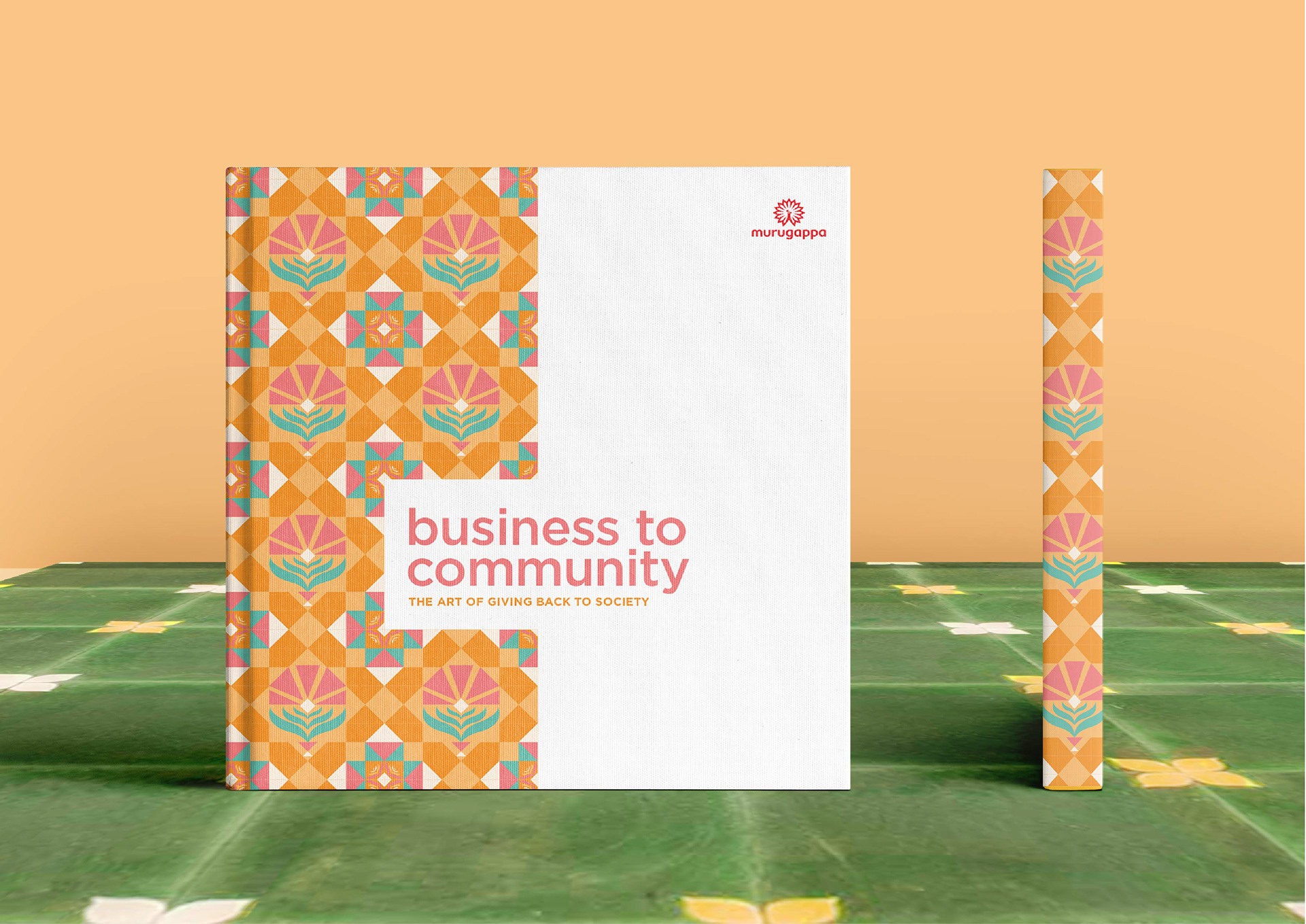
Design a coffee table book for the Murugappa Group, a 120-year-old and India's leading business conglomerate, to document their CSR (corporate social responsibility) activities.
Design Challenge
Since we had perviously worked on a brochure for the client to briefly document their social work, the coffee table book needed to be unmistakably different, in approach and design, while highlighting the initiatives carried out by 28 different group companies in detail.
The Outcome
A strong visual theme was created by combining photography and graphic elements inspired by the Athangudi tile. Each section has a featured impact story followed by 2-3 small stories, all unified through a colour palette. The final book captures the scale of the various projects, fosters empathy through quotes and imagery, and reflects the Murugappa Group's propositions: enablers of progress, value driven, people centric, empowered employees, inclusive environment.
Project Team: Copywriter - Nirupama Kapil | Brand manager - Anand S.
My Role: concept, design and layout
Duration: 4 months (Feb - May 2020)
The Murugappa Group's CSR
The AMM Foundation and Shri AMM Murugappa Chettiar Research Centre (MCRC) are two divisions of the Murugappa Group that oversee all CSR initiatives of the various group companies. Long before the Indian government mandated that 2% profits to be spent on CSR activities, the group was channelizing it's CSR activities through the AMM Foundation. Even today, this acts as a central organisation for sourcing partners to execute these initiatives.
Most of the CSR activities are defined geographically (in and around the factories) and by community (in the various industries they operate). This inspired me to develop a visual language that addressed these aspects while referencing the history of the group - Athangudi tiles.
Design Process
Initial layouts presented to the client used bright colours, authentic to Athangudi tiles.
In the next iteration, I toned down the colours to pastels as bright, complex patterns juxtaposed with photographs would have been visually overpowering. I used stock images as placeholders to further define the tone and warmth.
Design System
Crafting a unique design system to create a harmonious and seamless viewing experience across the 10 sections of the book.
COLOUR PALETTE
TONED PHOTOGRAPHY
One of the main challenges I faced was sourcing good-quality images from the client. Since most of the activities were in rural areas, they were documented using mobile phone cameras. I had to treat the low-res, grainy images with colour filters to make them look more appealing.
GRIDS
Using a 4 x 4 grid system and breaking the grid wherever necessary with tiles and images.
Typography
Gotham, a clean, geometric san-serif was used for headlines and statistics. This complemented the patterns and married well with the body copy in Sabon, an old-style serif. Esmeralda Pro was used sparingly for the quotes/testimonials to lend the overall design a classic yet decorative touch.
The Final
Click here to view the full book.

