Jagadeka Veeruni Katha
concept art | title design | type design | merchandise | packaging
As part of my culminating college project, I wanted to link my interest in art history, illustration, design and film. I worked on concept art and branding for the proposed remake of Jagadeka Veeruni Katha, a 1960’s Telugu hit produced by my great-grandfather, Aluri Chakrapani. Rooted in Indian mythology, the film deals with the real and the divine.
Solo project under the guidance of my professor, Dr. Margaret Thomas
Duration: 4 months (Dec 2018 - Mar 2019)
Project exhibited at:
Montage, Art and Design Graduate Show, Department of Fine Arts, Stella Maris College, Chennai, India - April 2019
Beyond Canvas: A New Dimension to Visual Art, TEDx Napier Bridge Salon event, Chennai, India - May 2019
Research & Analysis
Through books, articles, videos, interviews, museum and temple tours, I gained better insight into:
- The Hindu pantheon, myths, legends, practices and cosmology
- Art, sculpture and architecture of South India
- Indian textiles and jewellery
- filmmaking and animation processes
- steps and roles involved in developing concept art
- building materials and processes used for props and set building
- film branding, title design and merchandising
- illustrating for children
CONCEPT ART
Analysing stills from the film:


Analysing the plot to create a timeline tracking the recurrence of characters:
Identifying the main characters
- Pratap, the hero prince
- Rendu Chintalu, the sidekick
- Indrakumari, daughter of the God of lightning, Indra
- Varunkumari, daughter of the God of the ocean, Varuna
- Nagakumari, daughter of the God of snakes, Naga
- Agnikumari, daughter of the God of fire, Agni
- Rajan, the villain
- Ekasi, lover of Rendu Chintalu
Ideation & Sketching
Character Design
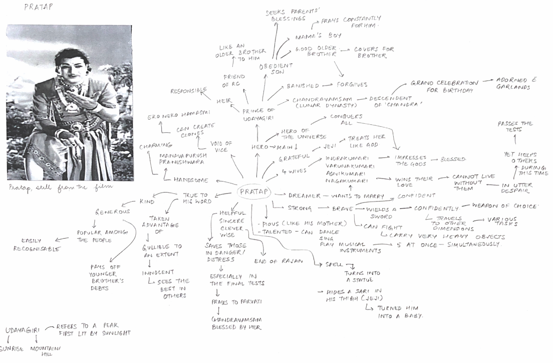
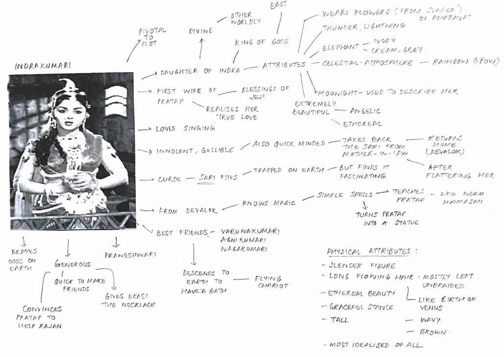
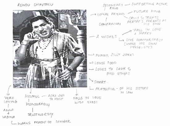
I explored the personality and physical attributes of each character before working on the silhouettes, costumes, jewellery and colour palette.
The process to design Pratap, the hero, one of 8 characters:
Final Character Line up
Prop Design
The plot of the film allows for a wide range of prop development such as furniture, jewellery, foliage, sculpture, vehicles, etc.
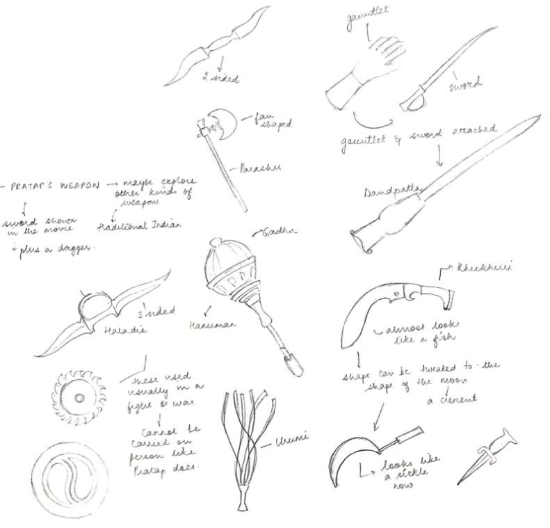
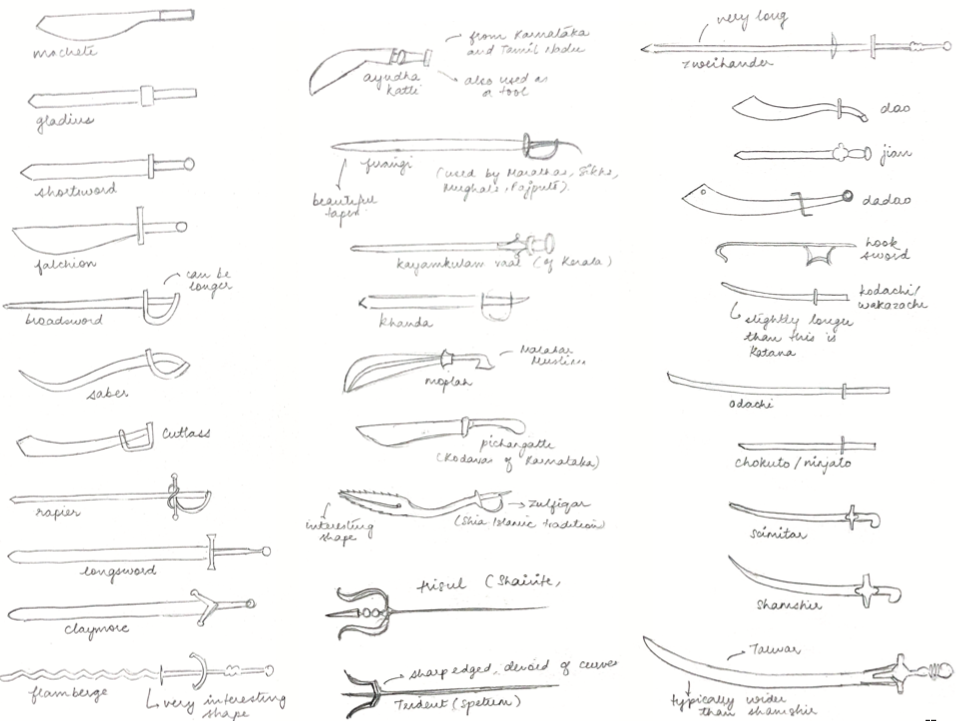
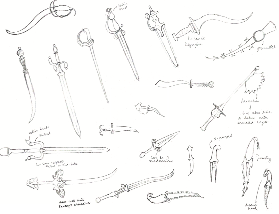
Pratap carries two weapons on his body during the length of the film. One is a sword and the other is a dagger. I researched about Indian weapons and the various types of swords, metals and ornamentation.
Prop 2 - Medicine from Nagalokam
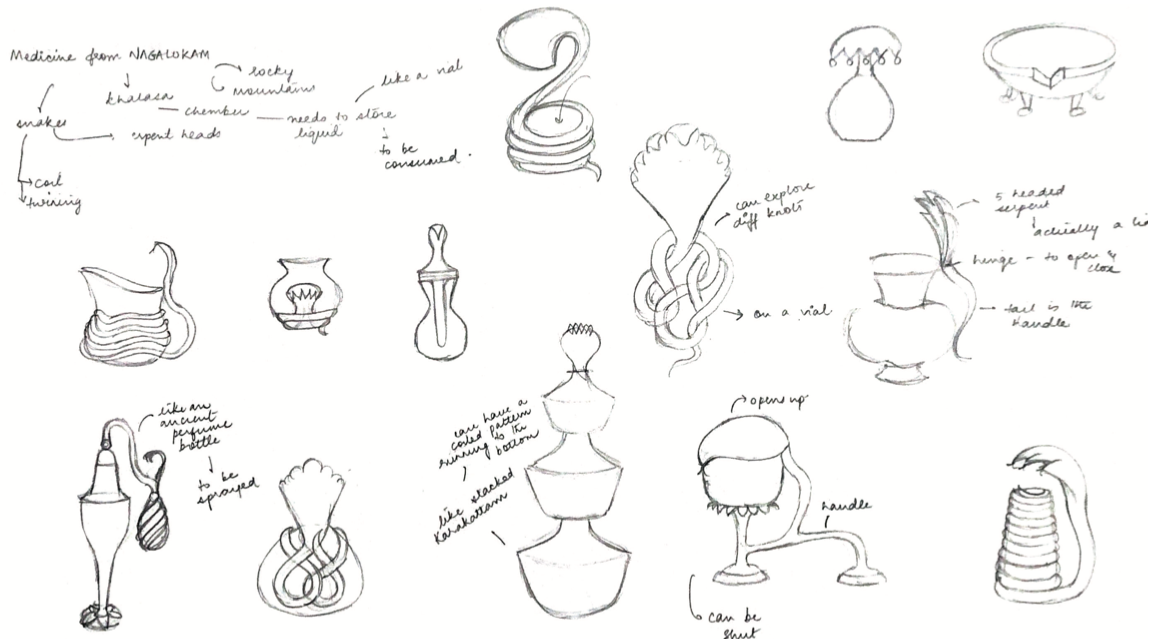
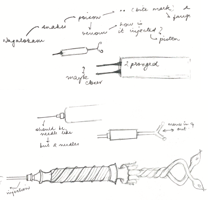
Pratap is tasked with fetching medicines from the celestial worlds. In the original, he brings back what appears to be a glass bottle or vial from Nagalokam. It, however, appears futuristic for its time. While reworking this prop, I tried exploring different vessel shapes, boxes, vials, etc. After doing a little research about how different medicines are administered, I decided to tweak the usual syringe (I found references of ancient syringes from South India and Ceylon). Instead of having the usual one needle, I added a second needle: to signify a snake bite.
Prop 3 - Varunakumari's vehicle
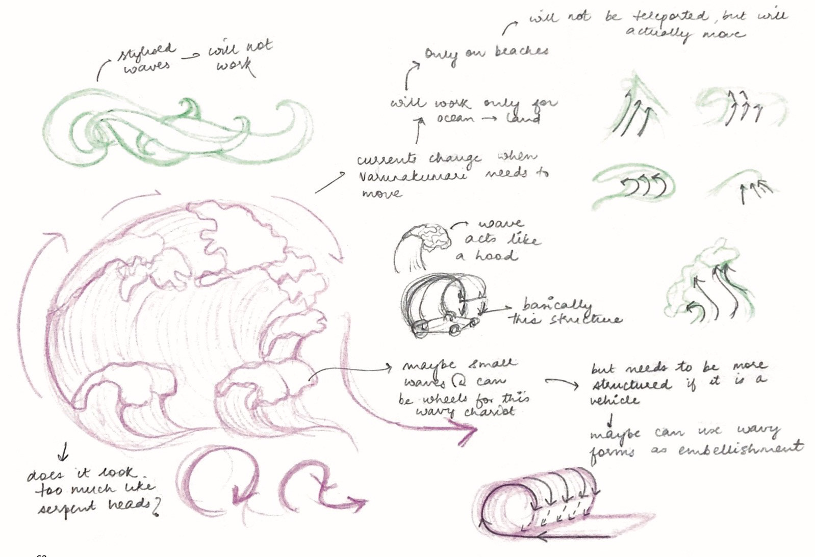
The term 'vaahanam' translates to "that which carries, that which pulls" and is used to denote either an animal or mythical being used as a vehicle by a Hindu deity. The devakanyas (princesses) have the ability to move from realm to realm. I used this idea of 'travel across the two realms' to create a vehicle that was specially designed to reflect the qualities and traits of the characters.
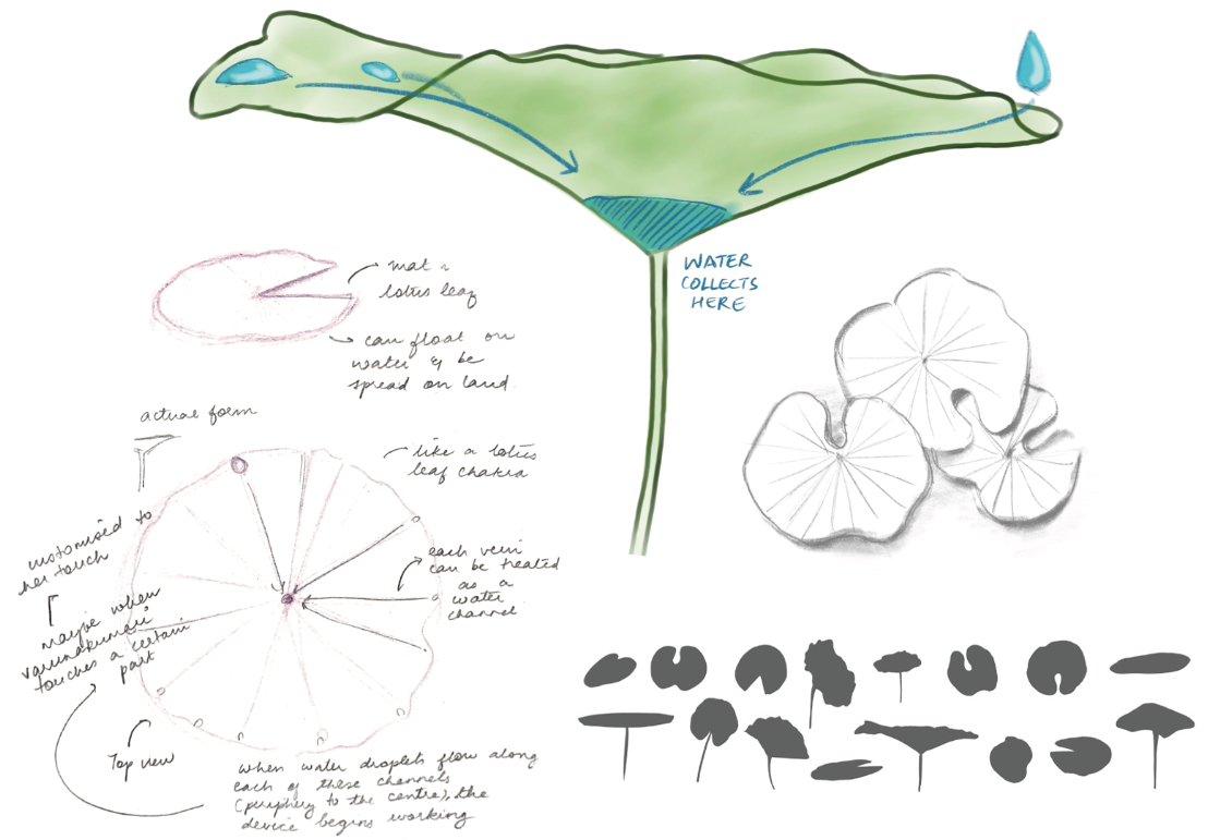
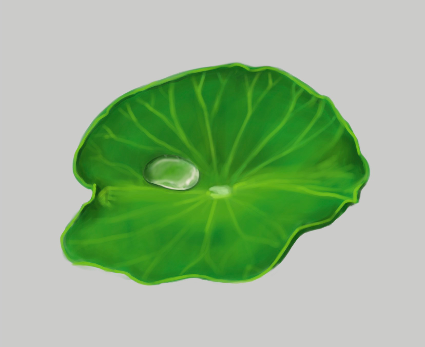
For Varunakumari, I designed a lotus leaf customised to her touch (like Thor and his hammer). When she adds a drop of water anywhere on the lotus, it will flow down beautifully along the veins and collect in the centre. This is a result of the 'lotus effect' (the self- cleaning property of the leaf called ultrahydrophobicity), exclusive to the lotus plant. This act of dropping water using her finger activates the vaahanam which functions as her personal teleportation device.


FILM IDENTITY
Logo design
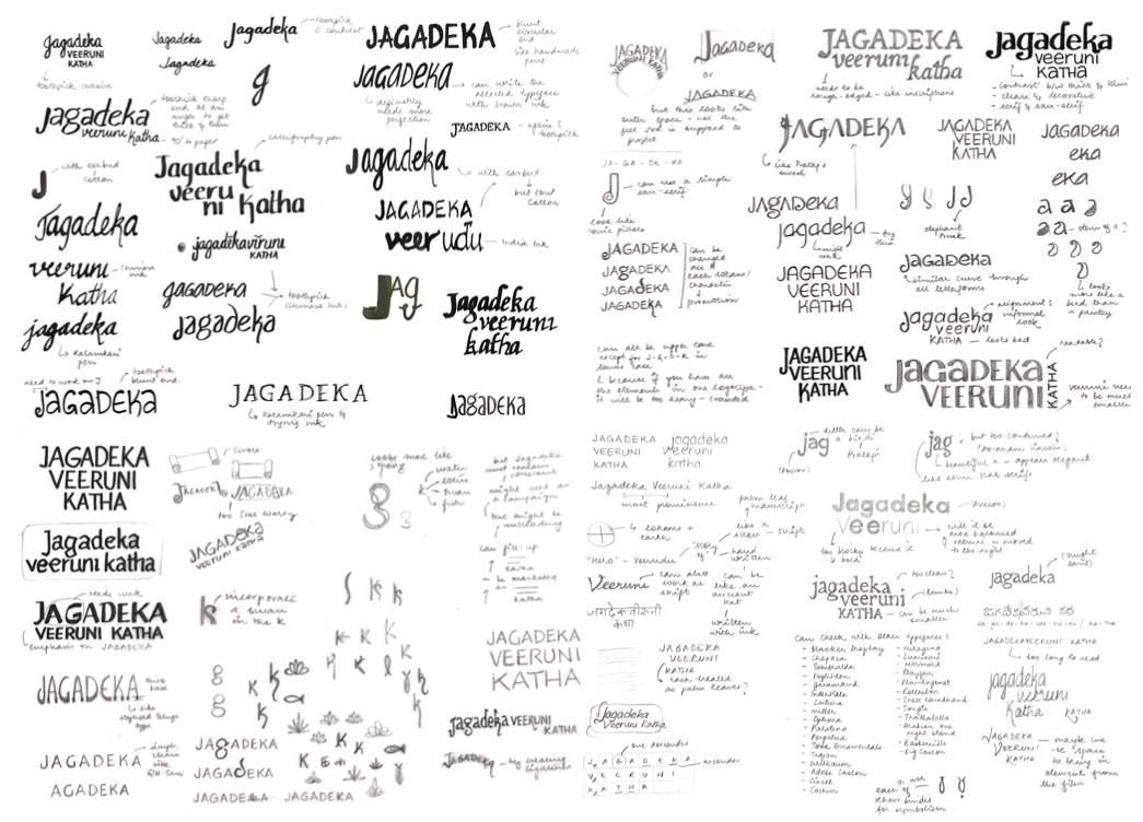
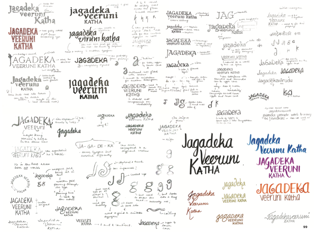
I needed the logo to be rich, royal, traditional and most of all, unique. After looking at Indian script, typefaces, scrolls, manuscripts and rock carving, I used India ink to write the name of the film repeatedly in different styles. I experimented with different tools such as a toothpick, a paintbrush, a calligraphy pen and even a kalamkari pen. I made a long list of typefaces that would suit the tone and mood of the film. After this, I began working on several logo options. I needed to take into account how the logo would look on a digital platform as well as print media.
Embellishing the logo
I digitally illustrating the logo to simulate the rich and exquisite gold zari weaving as seen on
South Indian textiles. I looked at traditional Kanjivaram motifs and developed the type accordingly.
Type design
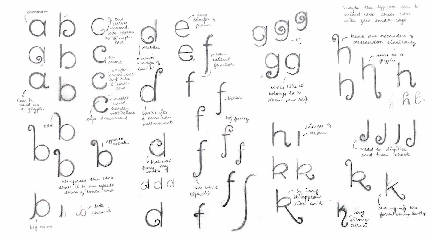
I worked on a custom typeface for the film based on Berlin Sans. I tweaked each letterform individually and stylised them to look like the type in the film's logo. I manually added swashes and flourishes and gave the forms a 'spirally' effect. I converted all the letterforms with ascendors and descendors to small caps to match the look of the logo. To create a synchronised and consistent mixed case, I changed the stroke weight to match the lower case forms. The final typeface is both earthy and rich.

Environment Design
The film, set both in the human and divine realms, allowed for the redesign of a number of environments.
Set Design 1 - Rajan's Palace
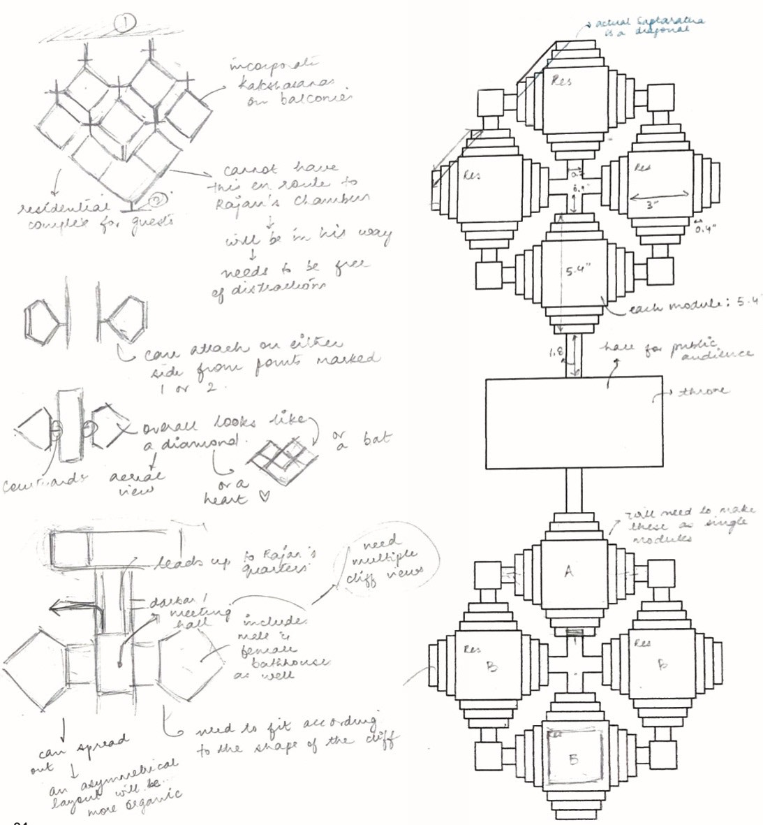
I based Rajan's quarters, comprising his personal chambers and other rooms, on a multi-storeyed octagonal structure. I had to make sure that I didn't embellish it too much as the structure was complicated by itself.
Set Design 2 - Pratap's Residences
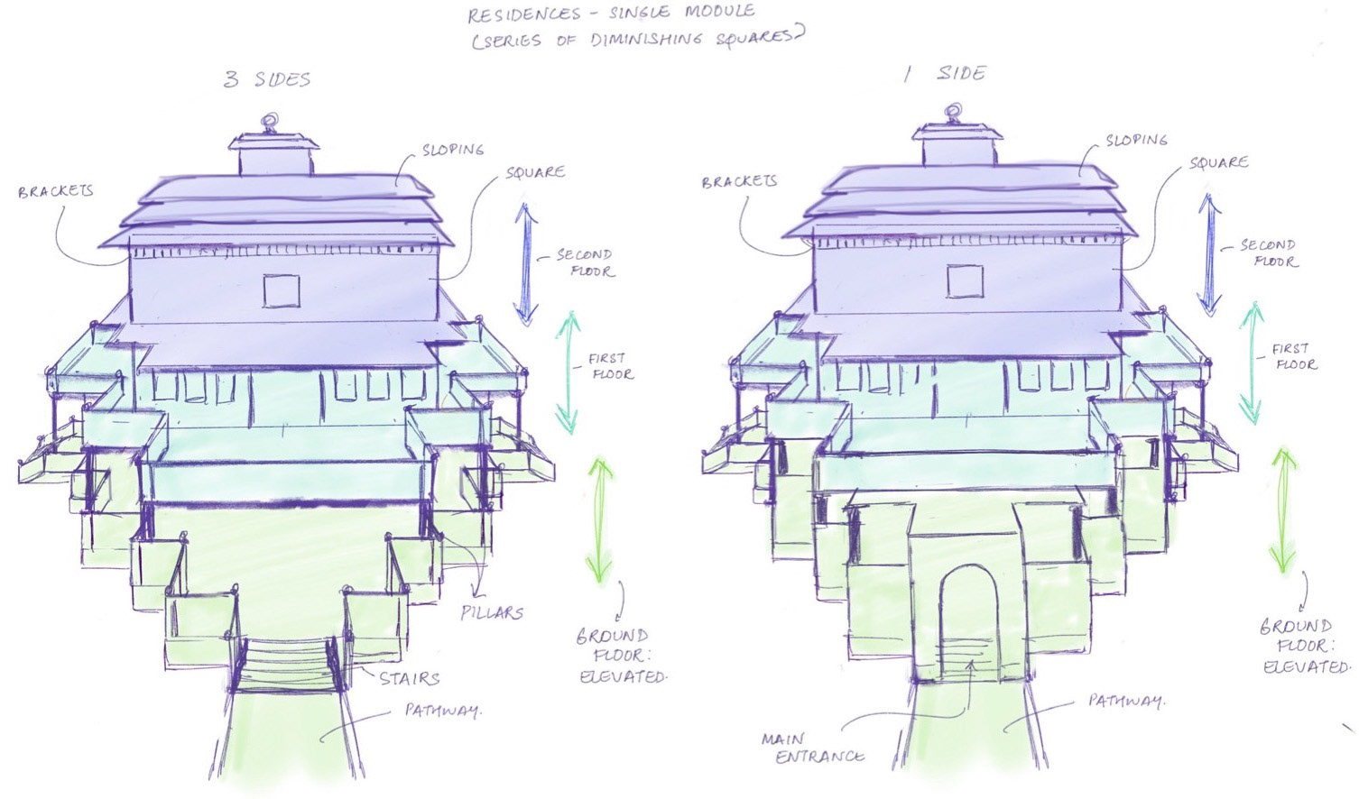
The residences for Rajan's guest, the hero Pratap, are designed as modules using the saptaratha plan. Four modules are connected to each other to form a cluster through pathways and separated by water. Every two modules share a meeting point or platform.
FILM MERCHANDISE
I created miniature sets to reflect my environments. I took this idea a little further and created 3-dimensional puzzles that could be sold as merchandise to promote the film. I designed the packaging for the puzzles as well.
Prototyping & Iteration
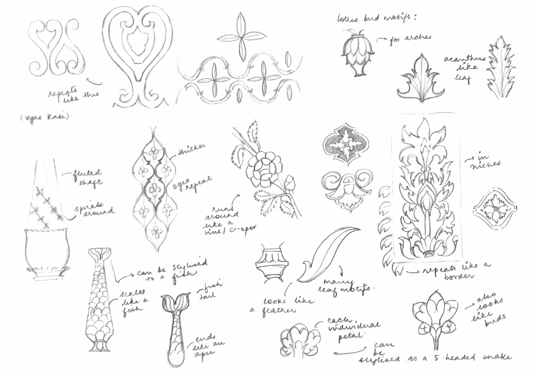
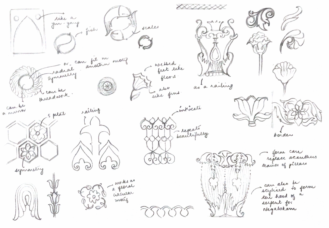
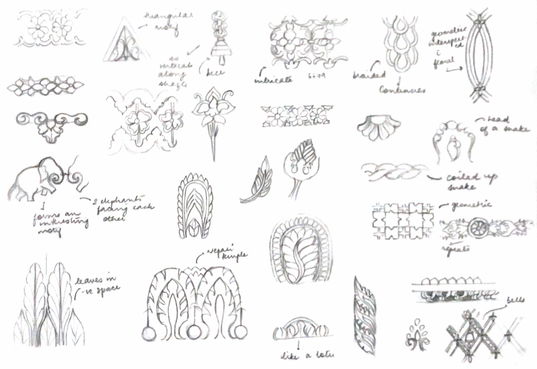
Sketches for architecture ornamentation: as friezes and relief sculpture

The Art of Jagadeka Veeruni Katha
Finally, I documented my process and sketches along with notes in the form of a coffee table book titled 'The Art of Jagadeka Veeruni Katha'. This was inspired by the many 'Art of' books sold by Disney, Pixar and Dreamworks, accompanying the release of new films.
